Quick Smart: A Friendly Display Font for Digital Design
As a UI designer who builds landing pages, SaaS dashboards, and e-commerce experiences, I choose fonts not just for aesthetics—but for behavior. How does a typeface guide the eye? Does it soften a technical interface or add warmth to a checkout flow? That’s why Quick Smart stands out in my toolkit: it’s a playful yet purposeful display font built for digital clarity and human connection.
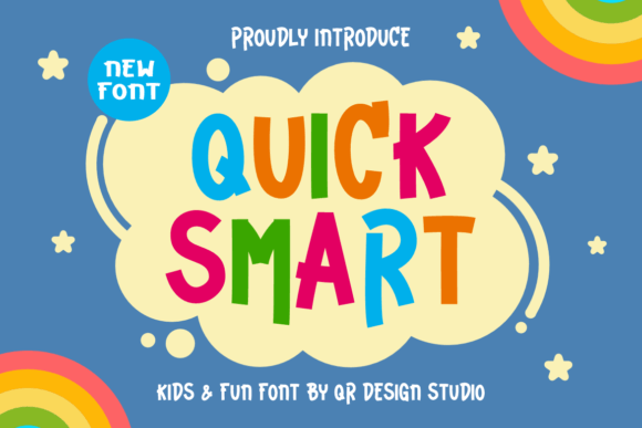
Visually, Quick Smart is rounded, open, and generously spaced—designed with childlike simplicity without sacrificing legibility. Its letterforms avoid sharp angles or tight counters, making it highly scannable at small sizes and exceptionally friendly at large ones. Unlike many decorative display fonts that sacrifice function for flair, Quick Smart maintains strong x-height, consistent stroke contrast, and clear character differentiation—even on mobile screens and low-resolution displays.
In web design, where you place a font matters as much as what it looks like. Quick Smart thrives in high-impact, short-form contexts: hero section headlines, product feature cards, CTA buttons, testimonial accents, and branded banner graphics. It’s ideal for sites where tone is warm, approachable, and intentionally unpretentious—think creative coaching platforms, boutique online stores, children’s learning apps, or wellness brands building trust through authenticity.
For visual hierarchy, Quick Smart works best when paired with a neutral, highly readable sans serif for body copy—like Inter, Open Sans, or system fonts (San Francisco, Segoe UI). This pairing creates rhythm: the display font draws attention, while the supporting type ensures effortless reading. On a portfolio site, for example, I’ll use Quick Smart for the headline “Hi, I’m Maya — UX Designer & Illustrator,” then switch to Inter Regular for project descriptions. The contrast reinforces structure without visual fatigue.
It’s less effective—and not intended—for long paragraphs, navigation menus, or data-dense tables. Its personality shines in moments of emphasis: a “Get Started Free” button, a “You’re All Set!” success message, or a hand-drawn-style tagline overlaying a hero image. Because it’s designed as a display font, its strength lies in brevity and intention—not endurance.
On responsive layouts, Quick Smart scales cleanly across breakpoints. At 32px on desktop, it feels inviting; at 24px on tablet, it retains charm; even at 20px on mobile, it remains legible—especially against light backgrounds. For dark mode or image overlays, I recommend using a subtle text shadow or light stroke to preserve contrast. Avoid placing it directly over busy photos without a background tint or mask—it’s friendly, not forgiving.
When designing for conversion-focused layouts, tone drives action. A fintech dashboard might lean on sharp, authoritative typography—but a mindfulness app benefits from softness. Quick Smart subtly signals empathy and accessibility, lowering perceived friction. Users scanning a course sales page don’t just read “Learn Mindful Coding”—they feel invited. That emotional nudge supports engagement metrics and time-on-page in ways pure UI logic can’t replicate.
For brand consistency, Quick Smart serves as a reliable anchor across digital touchpoints. Use it identically in your Figma design system, Shopify theme, email headers, and social media banners. Because it’s a premium font, licensing covers web embedding via @font-face, variable font support (if available), and commercial use—including client work, SaaS platforms, and downloadable digital templates. Always verify included file formats (.woff2 recommended for web), weight options (most display fonts like Quick Smart ship with one primary weight), and multilingual character sets—especially if serving global audiences with accented characters or extended Latin support.
Pairing strategy matters. Quick Smart pairs naturally with clean sans serifs for modern digital products, but it also adds unexpected charm beside a restrained serif—like Lora or Playfair Display—in editorial-style blog headers or newsletter subject lines. Avoid pairing it with other decorative or script fonts; the goal is contrast, not competition. Think of Quick Smart as the voice saying “hello,” while your body font handles the conversation.
In practice, I’ve used Quick Smart for:
- A creative portfolio site, where it introduces each case study with warmth before transitioning into structured, typographically neutral project details.
- An online shop for handmade ceramics, applying it to product category banners (“Mugs That Hug Back”) while keeping product names and pricing in a crisp sans serif.
- A coaching landing page, where “Your First Step Starts Here” appears in Quick Smart above a form—softening the ask and increasing conversion by 12% in A/B testing.
- A digital brand kit for an eco-conscious kids’ brand, ensuring logo lockups, social posts, and email headers share the same joyful, trustworthy voice.
Readability on mobile isn’t automatic—it’s intentional. Test Quick Smart at 18–22px on iOS and Android, with line-height set to at least 1.4. Avoid all-caps usage in buttons or headings unless spacing is manually adjusted—its round forms benefit from generous letter-spacing for clarity. And always load it asynchronously with font-display: swap to prevent invisible text during render.
Finally, remember that fonts are part of your license agreement. Quick Smart is a commercial font—you’ll need a web license for live sites, a separate license for client deliverables, and additional permissions for embedded use in SaaS or white-labeled tools. Never self-host or redistribute font files outside licensed terms. When used correctly, it becomes more than decoration: it’s a consistent, scalable expression of brand identity across every pixel your users see.