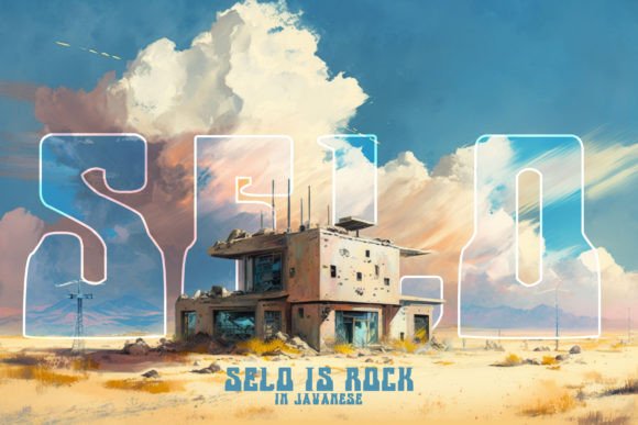
Selo: A Retro Display Font That Elevates Digital Branding
Two weeks ago, I was refining the hero section of a boutique online store for a ceramicist—hand-thrown mugs, earthy tones, soft photography—and the headline just felt flat. We’d tried three clean sans serifs, but none carried the warmth or intentionality the brand deserved. Then I loaded Selo into my design system preview. Instantly, the headline “Handmade with Quiet Confidence” gained texture, rhythm, and quiet authority. It wasn’t shouting—it was leaning in.
Selo is a retro display font that doesn’t lean on cliché. It’s not all neon outlines and pixelated edges. Instead, it offers subtle ink traps, gentle contrast between thick and thin strokes, and letterforms that feel hand-drawn yet precisely balanced—like vintage signage redrawn for modern screens. The curves are warm but controlled; the terminals have a soft flare, not a sharp cut. It’s nostalgic without being costumey, decorative without sacrificing clarity.
In practice, I used Selo for the primary headline, subheading, and product category banners—never body text, never small interface labels. That’s where its personality shines best: as a visual anchor. On desktop, it holds strong at 48–64px with generous letter-spacing. On mobile, I dropped it to 32px with tighter tracking (but never tighter than 20), and it remained legible—even over a softly blurred background image. No blurring, no rendering hiccups. Just confident presence.
What surprised me most was how well it supported scanning behavior. On the ceramicist’s homepage, visitors didn’t just read the headline—they paused. Their eyes lingered on the “S” and “L”, then moved naturally to the supporting sans serif body copy (I paired it with Inter, a neutral, highly readable variable font). That pause matters. It signals intention. It tells users this isn’t generic content—it’s curated, considered, human-made.
Selo works beautifully across digital touchpoints where tone and identity converge: a coaching website’s “Your First Step Starts Here” banner; a course sales page with “Enroll Before [Date]” in bold caps; a portfolio site’s project title overlay on a full-bleed case study image; even a small business newsletter header that needs to stand out in an inbox without screaming. It’s especially effective when you want to imply craft, heritage, authenticity—or simply a break from algorithmic minimalism.
That said, Selo isn’t meant for long-form reading, navigation menus, or form fields. Its charm lives in brevity: short headlines, button labels (“Join the Studio”, “Explore Collection”), section dividers (“Why Clients Return”, “The Process”), and branded social graphics exported as lightweight PNGs. I tested it in a sticky CTA bar on scroll—yes, it worked—but only at 24px with ample padding and high contrast. Anything smaller than 20px starts to lose its character on mid-tier mobile screens.
For readability, contrast is non-negotiable. Selo performs cleanly on light backgrounds (white, off-white, pale clay) and rich dark ones (charcoal, deep olive)—but avoid mid-tone greys or busy textures underneath. When placed over images, I always apply a subtle semi-transparent overlay (15% black at 70% opacity) or use CSS background-clip: text with a solid fallback color. Never rely on browser-default anti-aliasing alone.
Font pairing is where Selo becomes truly versatile. I consistently pair it with a neutral, highly legible sans serif—Inter, Manrope, or even system fonts like -apple-system—for all UI text, paragraphs, captions, and buttons. For more editorial or print-leaning digital brand kits, I’ve paired it with a warm, low-contrast serif like Literata or Crimson Pro—especially effective in blog headers or email signatures. The key is contrast in function: Selo sets the mood; the companion font handles the work.
Before deploying, I checked what’s included: six weights (Light through Bold), true italics (not skewed), OpenType features like stylistic alternates and ligatures, and robust Latin multilingual support (including accented characters used across Western European languages). No missing glyphs in French or Spanish product names. The webfont files were optimized—WOFF2 only—and loaded fast, even on 3G simulation. Licensing was clear: one-time purchase with commercial rights for websites, client projects, digital templates, and SaaS dashboards—no monthly subscription, no hidden usage caps.
I also tested it in real-world layout constraints: a responsive hero with max-width: 90ch, a sticky navigation that shrinks on scroll (Selo stayed crisp at reduced size), and a dark-mode toggle (the font retained its weight and contrast without manual adjustment). No surprises—just consistency.
One practical note: Selo doesn’t include a matching monospace or icon set, so I kept those elements separate—using SF Mono for code snippets and Feather Icons for UI actions. That separation actually strengthened the hierarchy: Selo = voice, Inter = utility, icons = function. Each had its lane.
For creative business owners building their own sites—or designers choosing type for clients—Selo bridges aesthetic and intent. It’s not just “vintage-looking.” It’s a deliberate typographic choice that says, “We value craft. We honor process. We’re not rushing past the details.” That resonance translates—not as nostalgia for its own sake, but as confidence in a distinct digital voice.
If you’re refreshing a landing page, launching a new course, redesigning a portfolio, or defining a brand kit for the first time, try Selo where it matters most: in the first words people see. Give it space. Pair it wisely. Let it breathe. Then watch how much quieter, clearer, and more intentional your whole layout feels.